Chart Types and Timeframes
The same price data can be drawn three completely different ways, and none of them are wrong, they just show different amounts of the same story.
Three views of one move
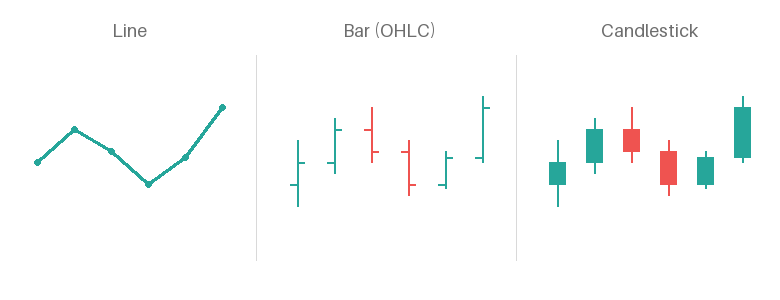
Same six bars of price data, drawn three ways.
A line chart plots one number per period, almost always the close, and connects them into a single continuous path. It’s the cleanest view for spotting a trend at a glance, but it throws away everything that happened inside each period. A bar chart brings that back: a vertical line for the high-to-low range with small ticks for open (left) and close (right), giving you the full range plus direction without a solid body to look at. A candlestick chart carries the same information as the bar chart, high, low, open, close, just drawn with a filled body between open and close instead of ticks, which is why the body and wicks read faster at a glance than a bar chart’s ticks do. Most traders end up on candlesticks for exactly that reason, though the underlying data is identical either way.
Timeframe changes what a candle means
A timeframe just sets how much time one candle covers. An H1 candle summarises an hour into one open, high, low, and close, and a D1 candle does the same for a full day, so the same instrument can look completely different depending on which one you’re looking at. A sharp reversal on M1 might shrink to a small wick on H1, and a level that looks important on D1 might not even show up as a distinct candle on M1.
Example: GER40 drops fifteen points in two minutes on M1, which looks dramatic zoomed in. On H1 that same drop is a single lower wick on an otherwise unremarkable candle, because the price recovered within the hour and the H1 close barely moved.
Using more than one timeframe together
Higher timeframes set context, the overall trend, the levels that matter, the bigger picture the smaller charts sit inside. Lower timeframes are where entries get taken, since they show the detail a higher timeframe candle compresses away. A common approach is to check D1 and H1 for direction and key levels first, then drop to M15 or M1 once that context is set, rather than picking a single timeframe and expecting it to answer every question on its own.
Key takeaways
- Line, bar, and candlestick charts can all show identical underlying data; they just differ in how much detail is visible at a glance
- A candlestick chart is a bar chart with the open-close range filled in, which is why it’s easier to scan quickly
- A timeframe sets how much time one candle summarises: what looks dramatic on a low timeframe can be a single wick on a higher one
- Higher timeframes give context and key levels; lower timeframes are where entries get refined
- Check more than one timeframe before trusting what a single one seems to be showing
Nothing on this page is financial advice. Trade your own account, manage your own risk.
Nothing on this page is financial advice. Trade your own account, manage your own risk.